Although I am not the one animating in the group it's still interesting to look at the processes animators take. The sequences below are from Ratchet and Clank: A Crack in Time and show the first basic layout to the block in and then the final cinematic used in the game. The reel gives me an idea of the processes I should take if I am given the role of animator.
Ratchet and Clank Cinematic Sequences: Layout to Final from Sean Coleman on Vimeo.
Thursday, 6 December 2012
Alien Rig
The alien was more frustrating rather than difficult. The frustration partly came from the weight painting. I couldn't seem to get it right as every time I moved the alien into a different position something would turn the wrong way or would stay put.
Dealing with Hierarchy was another thing I would need to learn as well. I really need to get into the habit of naming conventions and keeping everything neat and tidy. This is particularly important if I am working in a pipeline where I would have to give this rig to an animator who would expect me to have done all of these things.
I'm happy with how the alien has turned out however I feel I need to learn a lot more and keep up the habit of naming things on the go.

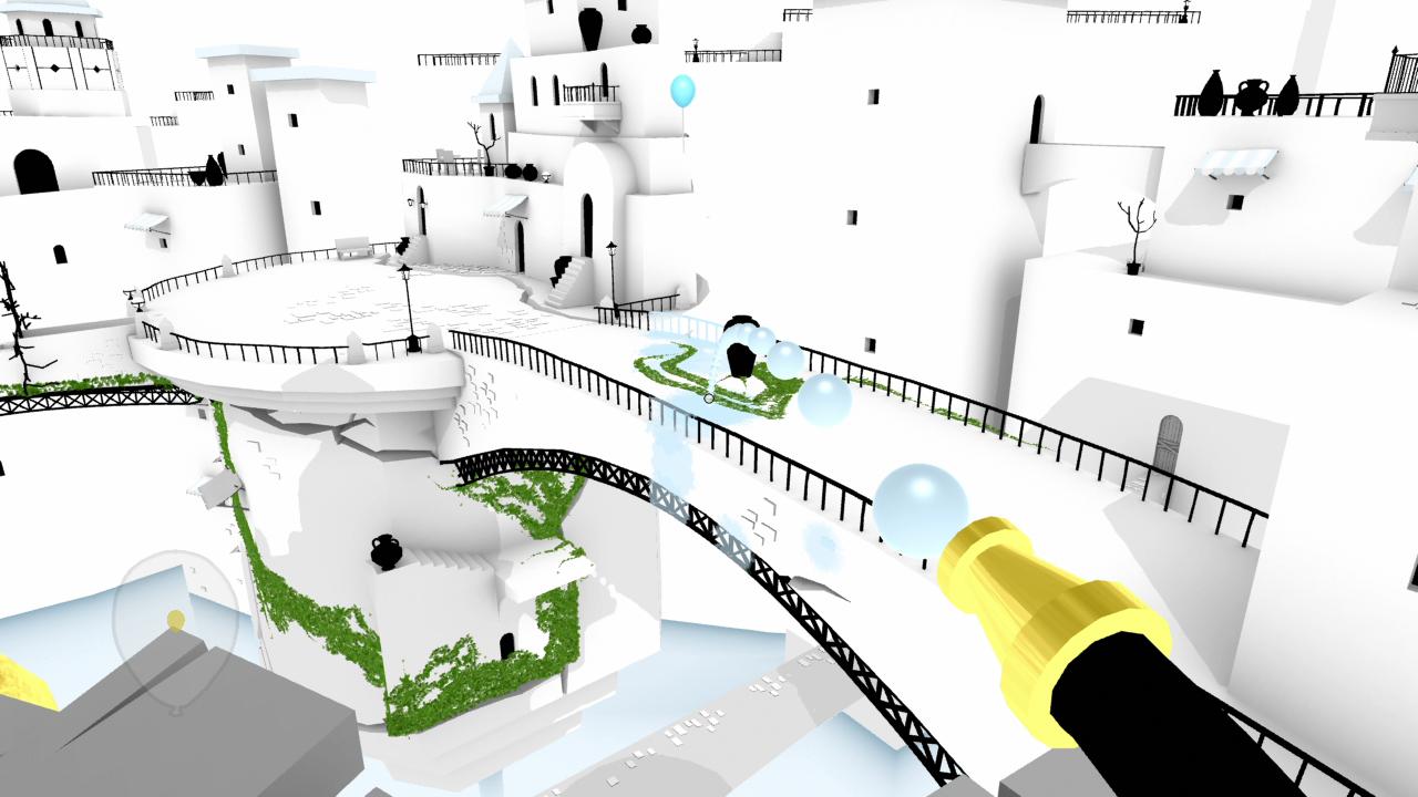
Finished Environment!
I'm happy to say that the environment is complete a day before the deadline. I'm really happy with how the workflow for the environment and character design has been really steady and how we've managed to keep on top of it. Hopefully everything else will come together fine.


Flobots
I came across the music video for 'Handlebars' by Flobots and thought the art style was very distinct. It uses comic book techniques like thick lines and polka dot shading making it quite interesting to watch. What interested me the most were the polka dots and the muted colour scheme that were used. I thought it would be great if we could try and implement that in our environment especially the polka dots as it would be a nice effect on the simple textures we have.
I asked Annabeth about this effect and she told me about light cookies. Light cookies are sort of like putting a transparent piece of paper over a light to create shapes. I tried my idea and thought it looked quite good.
Here is what it looks like:


The Unfinished Swan
I recently finished playing
through The Unfinished Swan. What
originally drew me to the game was the really unique yet limited art
style. They've managed to make quite a dark world by using soft and child-like colours. It seems like a lot of effort went into choosing the right sort of colours and seeing how they would work when applied minimally.


Foliage
-noscale.jpg)
I found these nice plant textures used in a Minecraft texture pack. I've always admired the unique aesthetics of Minecraft and I really like the simplistic way the flowers were made. I've been trying to find a way to give everything in our environment a unique style so these flowers were really interesting to look at.
I've made 7 variations of foliage to place around the environment. I've tried to keep them quite basic yet varied enough to keep the plant life interesting and not too copy and paste.

Creation Kit - Kit Pieces
During the summer holidays I
had a go with Skyrim's Creation Kit. The tutorial's showed me how to
make a dungeon and I found out that the majority of the buildings in
Skyrim were made using kit pieces.
Kit pieces are large and varied pieces of environment that fit together to make the dungeons and temples you explore. You can build large environments quickly and easily by simply dragging and dropping the desired piece into place.
This method seems to be best suited for large open world games like Skyrim as it would minimise the time and effort as well as add the variety to sustain player interest.


Young Bird Texture
Making the texture for the younger bird was quite easy now that I have established an art style. The Elder Bird and the early stages of the environment were more of an experimentation to see what would work, and now that I have a good idea I can work through the texturing at a steady pace.
I start by blocking in the colour's Sarah selected for her and then pick lighter and darker variations to make it look more interesting. I then edit the line work from the UV map and erase lines that I don't want to keep and add ones where they should be.
As I was going to keep the model's blocky I would have to keep the texture's relatively simple as well. A detailed texture on a blocky model only seemed to emphasize the blockiness(?) of the model. It didn't really look that good because of it. A simple texture kept this to a minimal and the lines made the blockiness look intentional and quite good.
I also did a quick painting to get a better idea of what the girl would look like:

Here is the finished UV map and model with the texture applied:


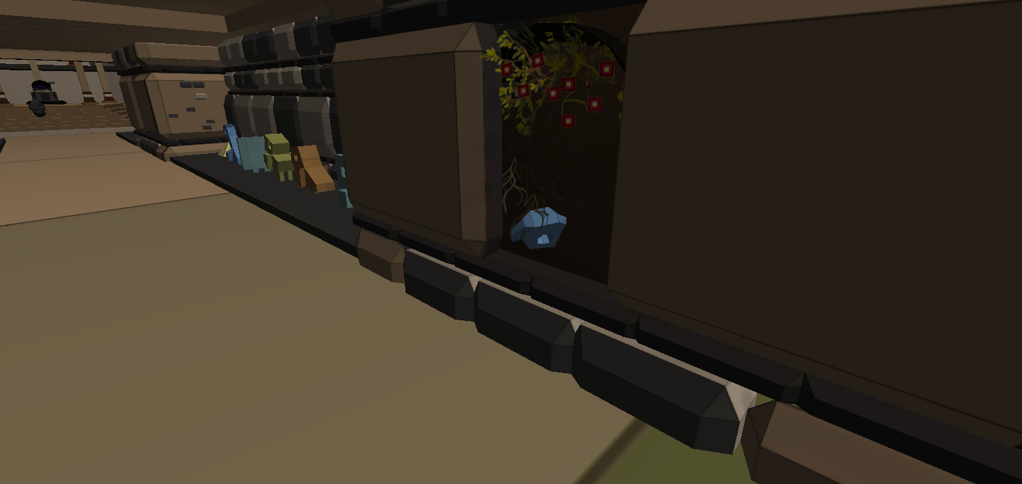
Clutter
The most surprising thing I found with the environment is that it is quite hard to fill it with stuff.
I asked people about what kind of items I should make and they nearly all said the same thing: pots, statues, broken bits of the temple, boulders and lots of plant-life.
To get a better sense of this I looked at the master of clutter and the bane of my inventory, Skyrim.
Skyrim's dungeons are filled with all sorts of random and useless things. However it manages to fill up the majority of Skyrim's dungeons and give them character and the feeling that they've been lived in for a long time. I plan to make several variations of pots and statues to give the environment character and more depth.


Here are my statues and pots. I tried to suggest something like a story by placing the statues in varied places. For example, I placed one in an alcove that had been badly damaged with dirt almost completely covering the statue. The player might think that the building is old and the walls have caved in or a disaster occurred not too long ago.


Pretty Pillars
Now that Daryl and
Sarah have completed the environment, it is my job to make the textures.
I need to remember to keep them relatively simple as I am making the
majority of the texture. I can't get bogged down in making one really
pretty pillar or something silly like that that I've done before.
I've decided on going with a style similar to The Unfinished Swan as it would keep the workload on track and I won't be taking too long on a single asset.

I've decided on going with a style similar to The Unfinished Swan as it would keep the workload on track and I won't be taking too long on a single asset.

Young Bird Model and Process
Before I began
modelling I looked at the character and decided that the body would be
the best area to start. I blocked out the basic shape and then worked on
the topology which was relatively easy.
I then extruded edges from the neck and started to work on the head. I had to redo the head several times as the girl is supposed to be this cute bird-like person, however whenever I added the beak she would look like a really creepy scarecrow. I thought it was amusing that when I added the eyebrows she looked like a cute girl again. She just needed some aspect to make her somewhat human again.
What I learnt the most from modelling these two character's is to just continue modelling regardless of what they look like currently.
I modeled the hair piece separately from the main body due to the rigging process.


Textures are hard
Originally I was going to texture the Elder Bird the same way I painted the concept art earlier. As I painted and tested the texture I found that I couldn't emulate the style again. The textures looked very muddy and it just looked wrong.
This might have been due to the way we planned to use the model, time constraints and my own technical abilities. We preferred the model to be blocky rather than smoothed as we liked the sharp and angular style. I didn't have the time to experiment and get the texture right as I had to make the texture for the young bird and the environment however I still wanted to have a distinct aesthetic.
I kept the colour's basic and minimalistic. I also treated the pattern on his back in the same manner, taking it into illustrator to make sure the lines were sharp and distinct. Annabeth also suggested to try make the texture's look like water colour. I liked the concept and applied a watercolour sheet of paper and set it to multiply and then applied it to his cape.


Elder Bird Modelling and process
The Elder bird was
challenging as I had never modelled anything as big or complex.
Before I started modelling, I attempted to figure out the best way to
approach this model. After some thought I decided the head would be the
best starting point.
I found that the head had two focal points, the beak and the mask-like area surrounding the eyes. As these were interesting and distinct areas of the face it would be easier to model and these areas would help to inform the topology of the rather shapeless head. I modeled the beak and the eye area separately, attached them to a sphere and worked on the topology.


After modelling the head, I began work on the body and arms. I had trouble working out how the cape would work on the bird, I finally decided to attach it to the arms and the back. Throughout the model, I constantly kept an eye on the topology, trying to keep the amount of faces I use to a mininum and make the most out of the ones I keep. I am pretty happy with the end result.

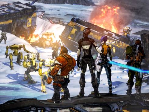
The Walking Dead and Borderlands
Early on in the module, we decided
our project should have a distinct art style to it. We really liked the
aesthetics of Borderlands and its unique style in a world of brown
first person shooter's. The thick comic book lines and shading really helped to inform the sort of style we want to try and aim for.
I recently played The Walking Dead and loved every minute of it. I like that Telltale kept it looking like the comics.


I recently played The Walking Dead and loved every minute of it. I like that Telltale kept it looking like the comics.


Mayan Culture and Buildings
One day we all decided to go down
to the library and do some research on Mayan culture. We found a wealth
of information and some pretty pictures to draw inspiration from. It was
nice to go through books rather than trawl through the internet,
unfortunately we don't have any digital scans of the scans we did take,
so here is the stuff we came across on the web.


Subscribe to:
Comments (Atom)